PRU Design System
Problem
As Prudential's digital products across Asia moved toward a more unified ecosystem, teams were still rebuilding similar UI patterns and making repeated interface decisions across products.
Business goal
Establish a unified design system that could support multiple product teams, improve UI consistency, and reduce repeated design and development effort.
My role
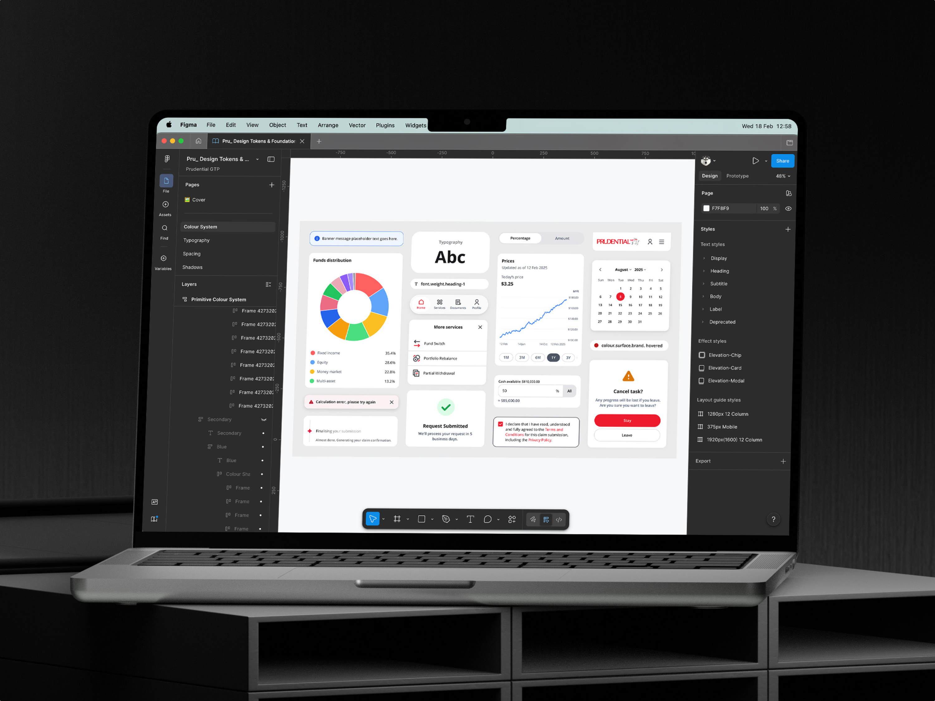
As the first designer responsible for the design system, I built the foundation through the core product. I translated brand guidelines and product patterns into tokens, components, and responsive templates, then worked with engineers to keep design and code aligned.
- design tokens
- 100+
- components
- 70+
- themes
- 2
- products supported
- 4
- faster development
- 40%
Foundation
Turning brand guidelines into a working product system
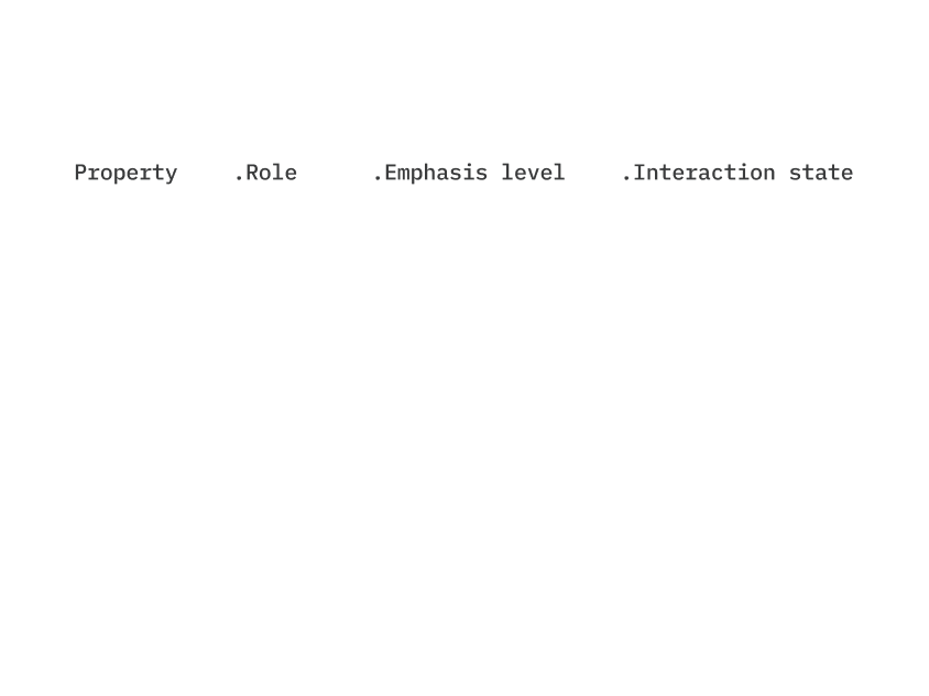
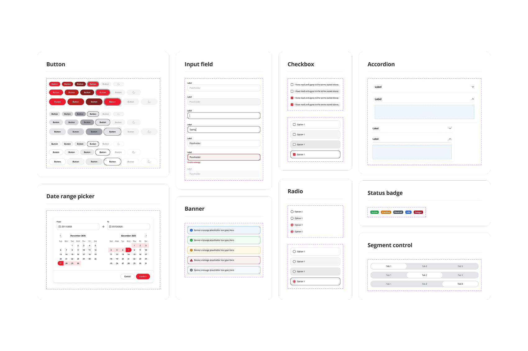
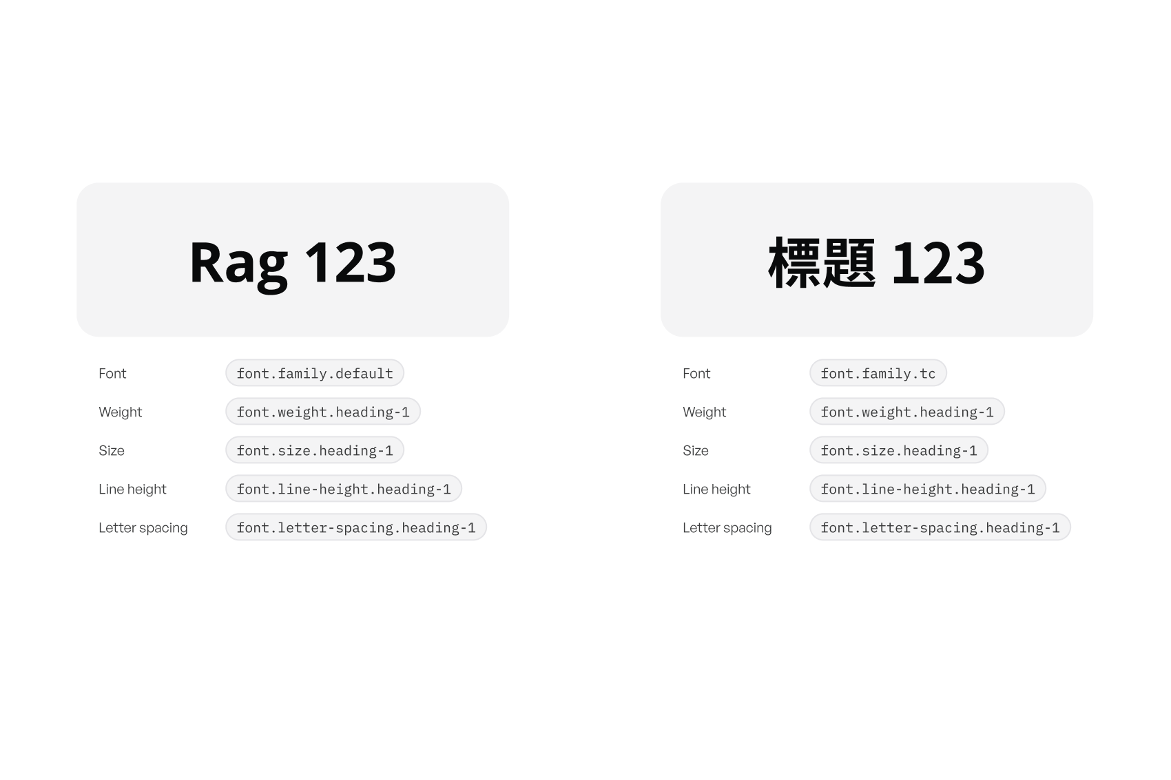
Prudential already had basic brand guidelines and existing products with reusable UI patterns. I translated these into design tokens, extracted recurring components, and aligned the system with Material Design principles because the new product was built with Flutter.
This created the foundation for buttons, inputs, banners, navigation, etc.

Governance
Deciding what belonged in the system
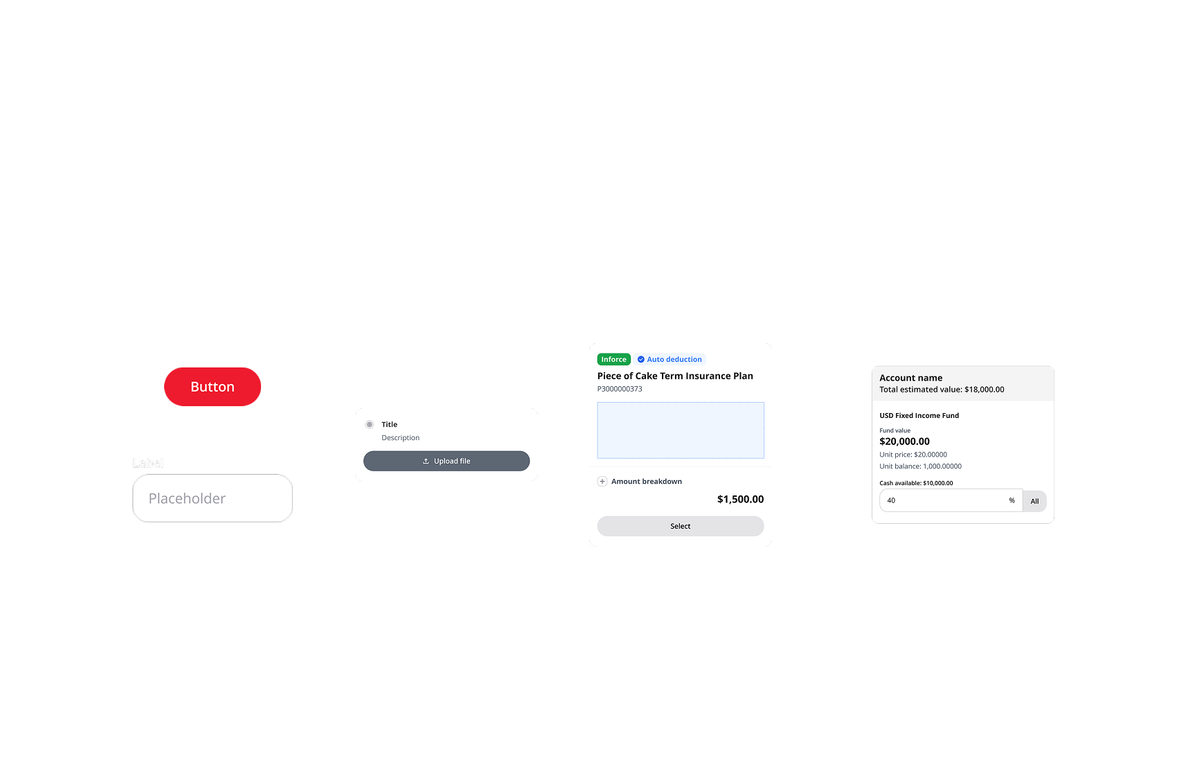
Not every repeated pattern became a global component. Buttons, inputs, and navigation were clear global components. But complex patterns like policy cards included different content, badges, buttons, and business logic, so I kept them as feature-specific widgets.
This helped the library stay reusable without becoming overloaded.
Templates
Creating templates so designers did not start from zero
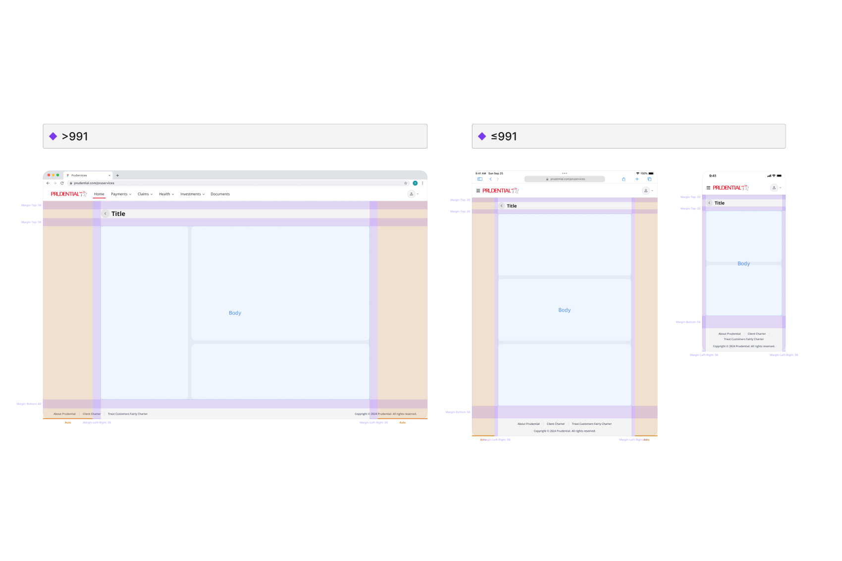
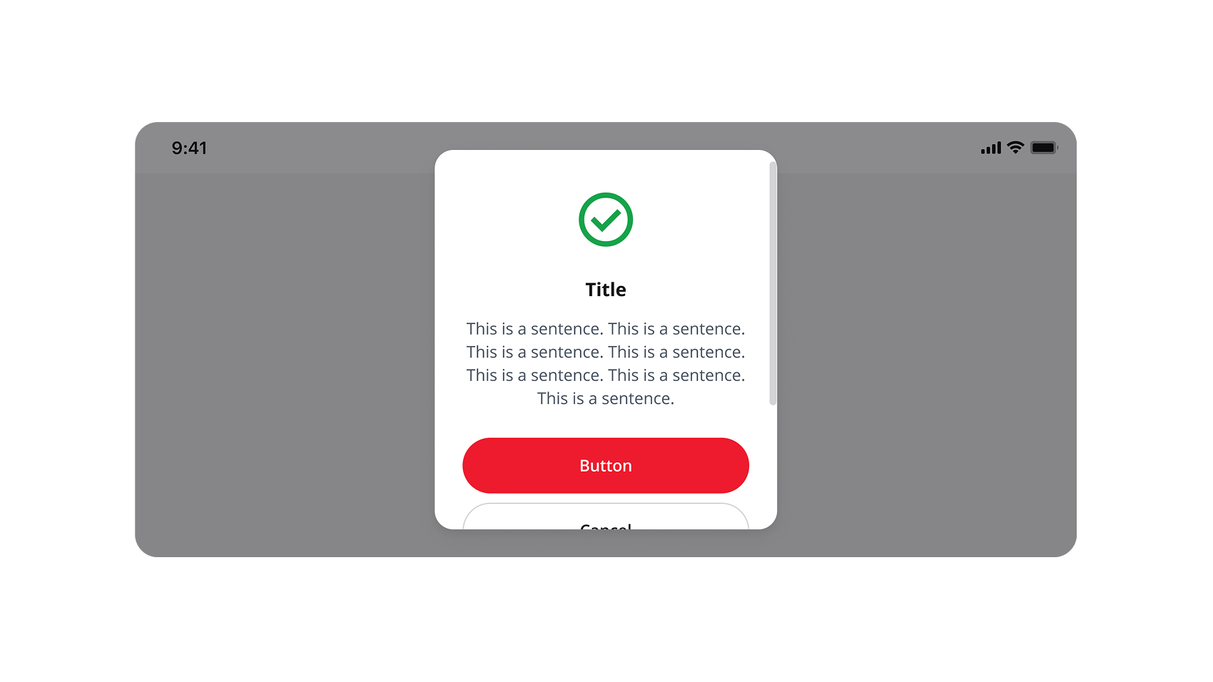
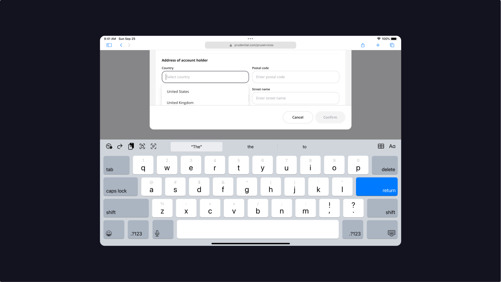
As the product grew, we saw repeated page layouts across features. I created responsive templates for common layouts, including breakpoints, small screens, keyboard states, and edge cases.
This reduced repeated design decisions and gave engineers clearer layout expectations.
Implementation
Keeping Figma and code aligned
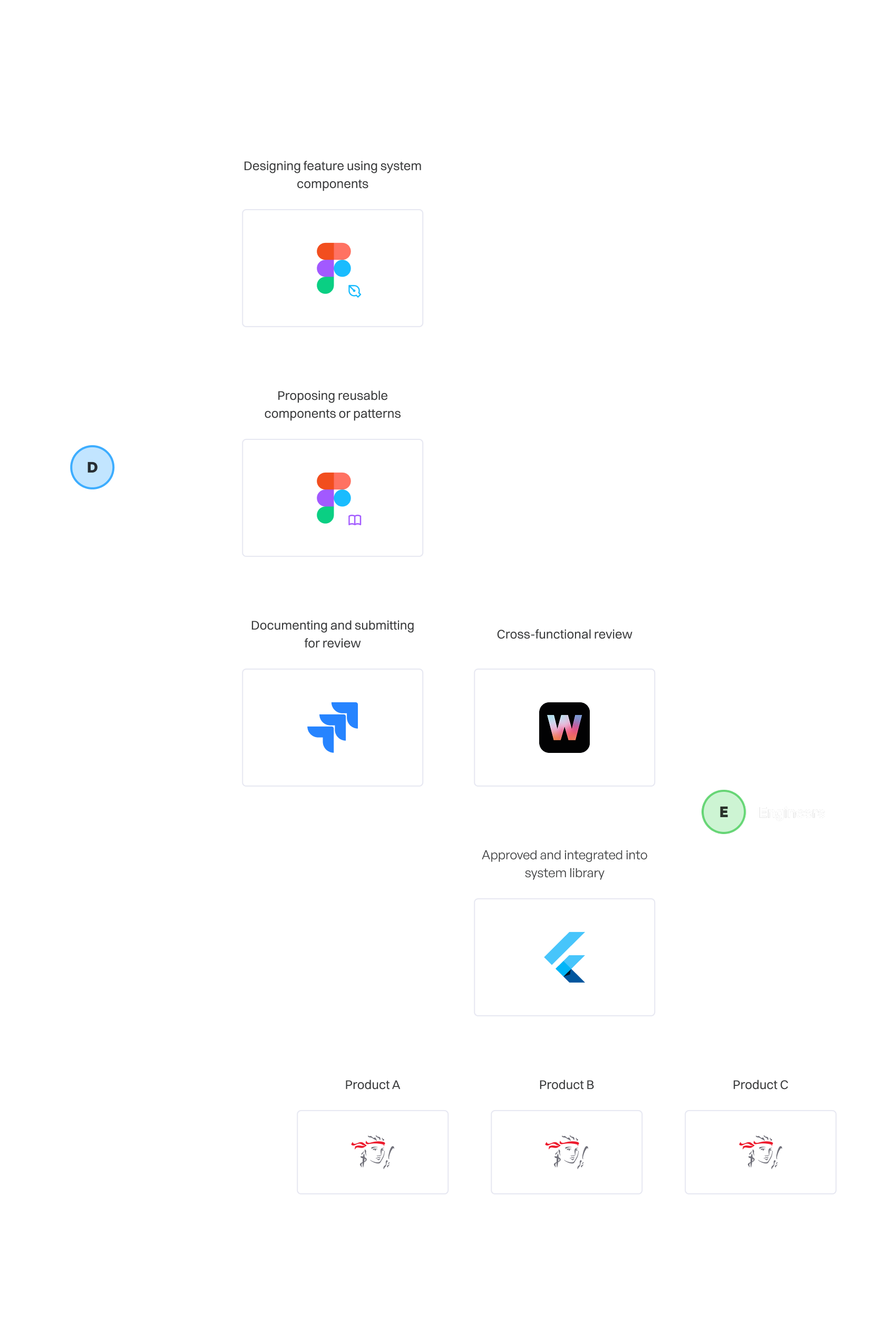
I organised the Figma library, reviewed build-ready files from designers, and checked whether components were used correctly before handoff. When engineers built components, I reviewed the coded version against Figma to catch spacing, colour, state, and responsive mismatches before QA.
This helped reduce small inconsistencies before they reached production.
Maintenance
The hardest part was changing components after teams depended on them
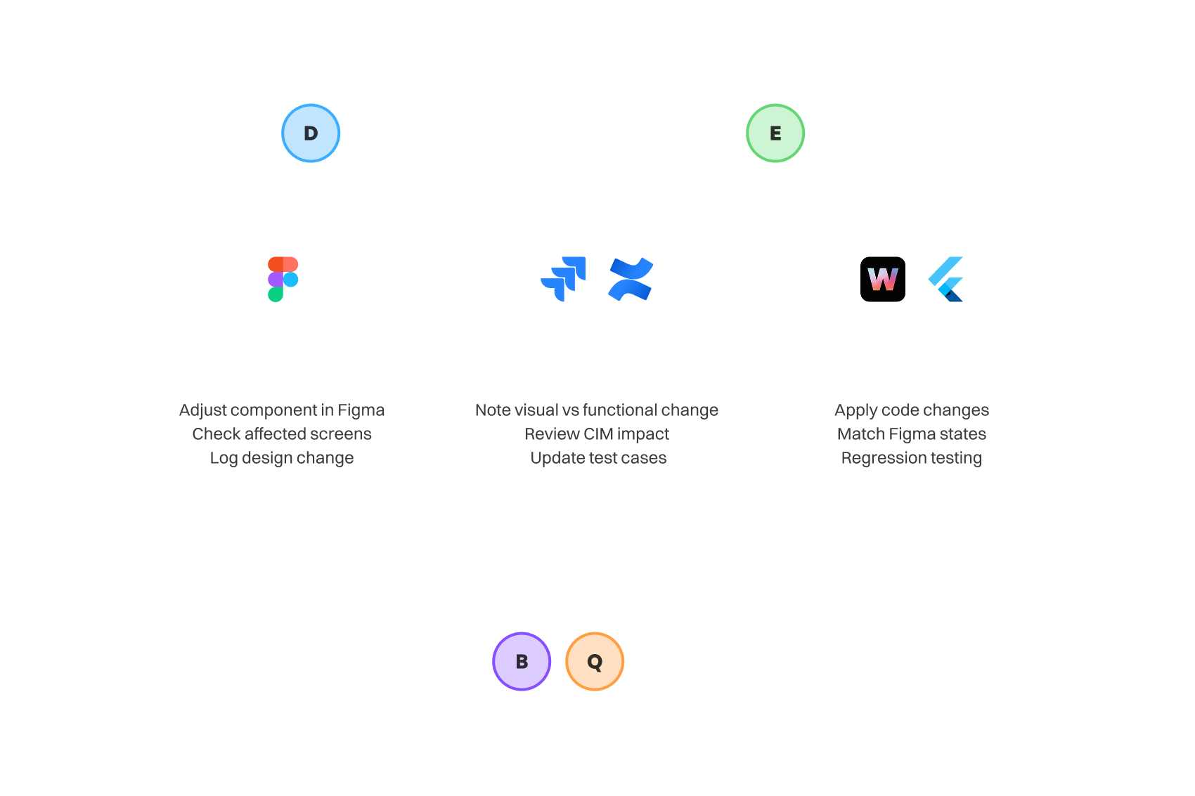
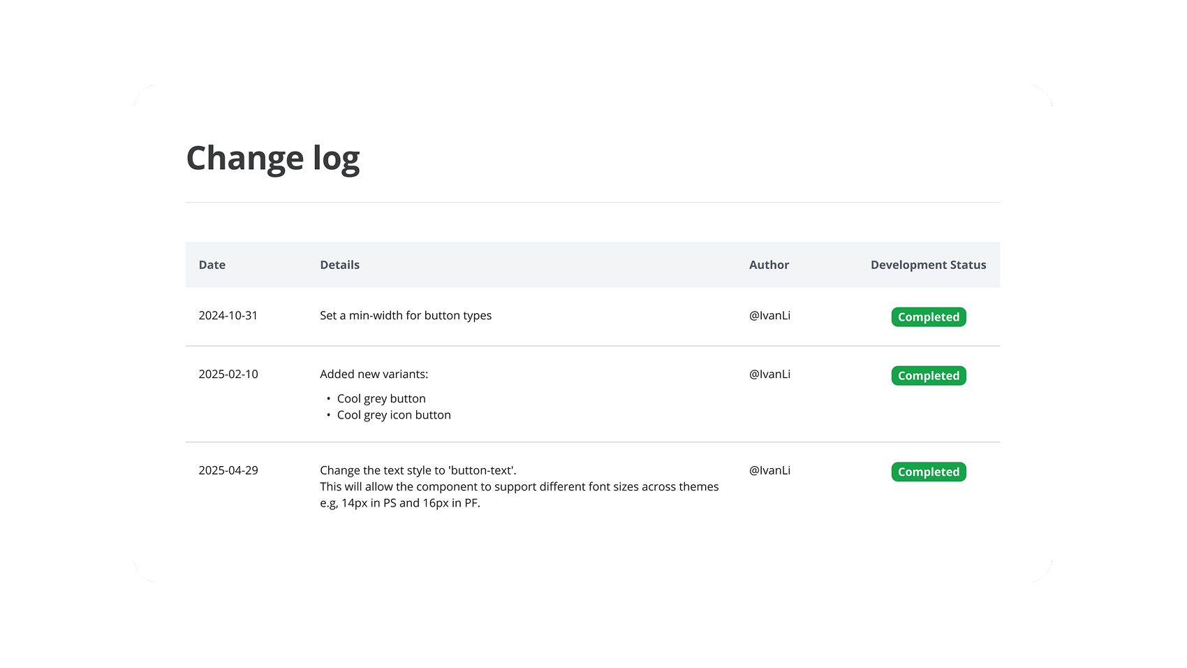
Building components was straightforward. Maintaining them was harder. For example, a simple colour contrast update could affect multiple screens. If the change was visual, we updated Figma and logged it. If it affected behaviour or functional specs, BA, QA, and engineering had to review whether CIM updates or regression testing were needed.
This taught me that a design system is not just a Figma library. It is connected to product requirements, QA, engineering effort, and release timing.
Scaling
Evolving the library without losing control
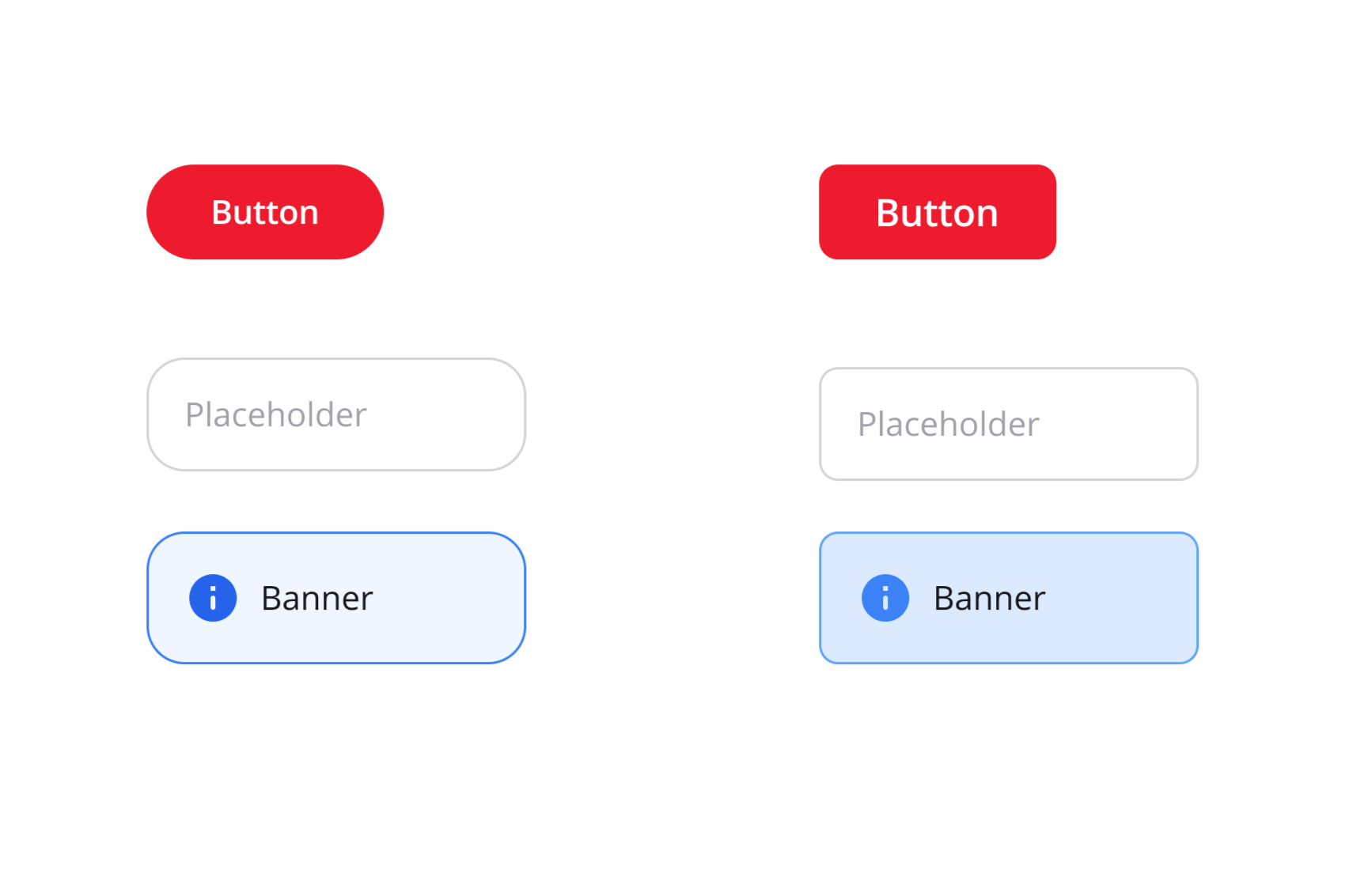
My deepest product work was on PRUServices, but the system was later reused by other Prudential product teams. As they adopted the library, they requested new components, variants, colours, and theming support.
I refined naming conventions and added variants only when they served reusable needs, so the system could grow without becoming messy.
Reflection
What I would improve today
Looking back, I would define success signals earlier. Beyond building the system, I would track practical indicators from daily work: design-code mismatches, component requests, accessibility improvements, and change requests that required BA, QA, or engineering review.
This project taught me that a design system is not successful just because it exists. It is successful when teams can use it confidently, evolve it safely, and see how it improves product delivery.